When I joined the Gmail team, I was surprised to learn that only 29% of Gmail users had created any labels. At first, I thought perhaps conversation threading and search made the need to organize our mail less important. But when we talked to people who use Gmail, we got a different story. People often asked us to add folders to Gmail, assuming no system of organization existed. As one person said in a usability study, "What are labels... and where are my folders?"
We realized that if you didn't know about labels, it would be easy to assume Gmail had no way to organize your mail. Not only were "labels" unfamiliar, they were kind of hidden. So, we set out to make labels more accessible, as well as more powerful. Most of the changes have been in Gmail for a while, but we're adding some new features today. We thought you'd enjoy a peek at the method to our madness.
The first thing we did was make labels look more like the sticky notes you use in real life. Making the interface mimic things you interact with outside the computer can sometimes improve ease of use.

We also made it easier to remove a label from an open conversation:

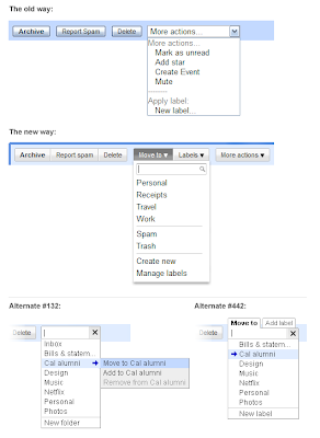
Then we worked on the actions you take to apply and remove labels. Before, to put a label on a message, you had to look under "More actions> Apply label." Not only was this option hidden in a generic menu, but the language wasn't what people are familiar with when it comes to organizing mail. We explored several alternatives:

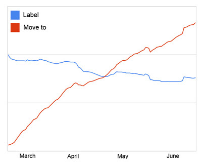
We also learned that if we made labels sound too much like folders, people got confused. For instance, while "Copy to" and "Add to" were easy to use, these terms made people think they were creating multiple copies of a message. "Move to" was familiar but didn't lead people to think they were creating copies. And people seem to have picked it up fast! Since the launch of the new menu buttons in March, we're seeing a 50% increase in new Gmail users trying labels in their first 2 weeks. And overall usage of the "Move to" menu surpassed that of the "Labels" menu within 7 weeks of launching:

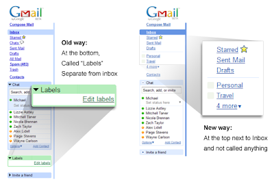
For our latest set of changes, we looked at how you access labels on the left side. In other email applications, folders get the royal treatment and are given a seat at the top near your inbox. But in Gmail, labels were stuck in a box below Chat — almost like we were telling people, "you don't want to use these." In testing, we discovered that it worked best to remove the terminology altogether and just place custom labels right under the system labels (e.g. "Inbox"):
 The last step was to add drag-and-drop. Now, you can drag mail into a label, or even drag a label directly onto a message:
Making it easier to process and organize your mail requires more than just labels, but we hope these changes start to improve the process. We have much more in store, so stay tuned and keep the feedback coming.
0 komentar:
Posting Komentar